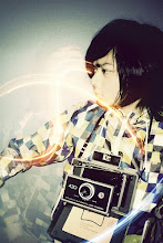
nice typeface john... of the "where do you begin" part =P is the font called sleeping pillow or something? looks similar to that pointy font i used for my poster too.. ooooh is that a holga cam? the look for this piece is so retro =P hehe!
i'm not a big fan of the type for the word "create" it's too much for the whole piece already, cuz of it's sketchy look. good start though =P can't wait how the final will look like
oh hey Raine. its not Sleeping pillow font. its walking by something.. its free for sue so i used it! lol i used sleeping pillow for my book jacket last semester. yeah.. hmm... create is our theme. but i like the drawn "create" i did... but well see what happens
sweet!!! didn't know there were more other "sketchy" looking typefaces out there. anyways, have you ever heard of si scott? cuz if u haven't, u should look into his designs! the create type you did reminded me of his style =) his is more like crazy insane.. lol. AWESOME DESIGNER I TELL U....!!!! look him up...for inspiration guy! i'm in awe by his stuff
here's a sample of his work http://drinkdesign.files.wordpress.com /2008/07/sicott2seed.jpg
Rewind..
-
Wow.. I havent written in this blog for a while. I guess it's cause I lost
the password haha x)
Ever since the New Year, I've been mostly partying every we...
When I am myself
-
So while I am on my hiatus from uhh.. myself I guess I may as well post
some things up. This is the kind of thing that I do when I am not doing
myself with...


.jpg)


6 comments:
Nice start :)
thanks. its not much but its a start! i left the scanninf for you.. and feel free to take everyhthing out! lol i dont mind
nice typeface john... of the "where do you begin" part =P is the font called sleeping pillow or something? looks similar to that pointy font i used for my poster too.. ooooh is that a holga cam? the look for this piece is so retro =P hehe!
i'm not a big fan of the type for the word "create" it's too much for the whole piece already, cuz of it's sketchy look. good start though =P can't wait how the final will look like
oh hey Raine. its not Sleeping pillow font. its walking by something.. its free for sue so i used it! lol
i used sleeping pillow for my book jacket last semester. yeah.. hmm... create is our theme. but i like the drawn "create" i did... but well see what happens
sweet!!! didn't know there were more other "sketchy" looking typefaces out there. anyways, have you ever heard of si scott? cuz if u haven't, u should look into his designs! the create type you did reminded me of his style =) his is more like crazy insane.. lol. AWESOME DESIGNER I TELL U....!!!! look him up...for inspiration guy! i'm in awe by his stuff
here's a sample of his work
http://drinkdesign.files.wordpress.com
/2008/07/sicott2seed.jpg
Post a Comment